You are using an out of date browser. It may not display this or other websites correctly.
You should upgrade or use an alternative browser.
You should upgrade or use an alternative browser.
News Graphic designers try to redesign the NASA insignia
- Thread starter Pipcard
- Start date
Boston Globe just trying to stir up controversy. Might be better if they put their weight behind a financial bailout package. At least the benefits would be more obvious.
Still, is there a need for an updated logo? What will the benefits of the rebranding be versus the costs? If the justification can be found, how about a logo contest so that someone with some kind of space vision can be found (seems obvious that the four involved in this little test did not have it)? And can we keep the Hollywood garbage out of it?
For what it's worth.
I'm not thrilled with any of these, especially that last one.
- Joined
- Feb 6, 2008
- Messages
- 38,965
- Reaction score
- 3,937
- Points
- 203
- Location
- Wolfsburg
- Preferred Pronouns
- Sire
The original is also kind of bad in my opinion. The best logo was this one:
I absolutely agree.
- Joined
- Jul 7, 2012
- Messages
- 1,519
- Reaction score
- 1,543
- Points
- 128
- Location
- Monte Hermoso - Argentina
- Website
- github.com
- Preferred Pronouns
- he/him

:facepalm:
boogabooga
Bug Crusher
- Joined
- Apr 16, 2011
- Messages
- 3,010
- Reaction score
- 16
- Points
- 63
The original is also kind of bad in my opinion. The best logo was this one:

The worm logo needs to stay gone. It's just so...80s. Sorry.
It's funny, but to me the more "futuristic" designers try to make something, the more dated it will look in the actual future.
Examples:
Cars with fins- late 50s-60s
Art Deco- 30s 40s
etc.
Urk. Are they quite sure those people were actual graphic designers? :blink:
Urk. Are they quite sure those people were actual graphic designers? :blink:
They probably are, but like newbies in the field.
D
Deleted Orbinaut
Guest
There are a few much better efforts elsewhere on the web:


- Joined
- Mar 31, 2012
- Messages
- 2,298
- Reaction score
- 4
- Points
- 0
The worm logo needs to stay gone. It's just so...80s. Sorry.
It's funny, but to me the more "futuristic" designers try to make something, the more dated it will look in the actual future.
Examples:
Cars with fins- late 50s-60s
Art Deco- 30s 40s
etc.
Art deco may look "dated", but Empire State Building is still the most elegant building in NYC. Especially inside.
Anyway, a good logotype must be simple (if a 5-year-old can render a recognizable version drawing from memory, it is good), communicate the message clearly and render correctly in black-and-white. The old logo fails on all counts. Contrast it with the logo used on LEGO Space:
Simple and to the point.
Here are some good design examples:
http://designshack.net/articles/graphics/50-fantastically-clever-logos/
http://designshack.net/articles/inspiration/10-tips-for-designing-logos-that-dont-suck/
http://mashable.com/2014/04/30/logo-design-tips/
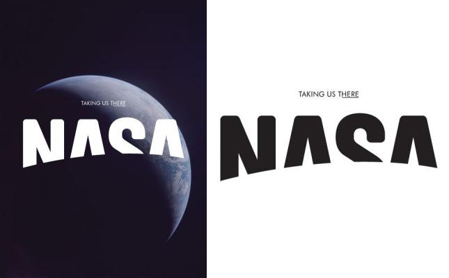
Looks like the cover of a comic book. Also, I think it needs a little musical accompaniment:
https://www.youtube.com/watch?v=uY3vgBzgYn4
")
In best Jimmy Fallon voice; "Eww!"
boogabooga
Bug Crusher
- Joined
- Apr 16, 2011
- Messages
- 3,010
- Reaction score
- 16
- Points
- 63
Art deco may look "dated", but Empire State Building is still the most elegant building in NYC. Especially inside.
Even if true, it doesn't mean that that we should start building new buildings in art deco.
- Joined
- Feb 6, 2008
- Messages
- 38,965
- Reaction score
- 3,937
- Points
- 203
- Location
- Wolfsburg
- Preferred Pronouns
- Sire
Even if true, it doesn't mean that that we should start building new buildings in art deco.
Why not? Only because it doesn't meet your taste?
Similar threads
- Replies
- 2
- Views
- 919
- Replies
- 1
- Views
- 4K
- Replies
- 0
- Views
- 2K